The days of cold gray walls and stark white interiors are fading fast. If you’re planning a renovation in Calgary or anywhere across Canada, 2026 brings a decisive shift toward warmth, depth, and nature-inspired palettes that transform homes into genuine sanctuaries. Here’s what you need to know to make smart color choices that will still look fresh years from now.
Quick Overview: The Standout Color Directions for 2026
The 2026 home renovation color trends lean heavily toward warm, grounded, and nature-inspired hues, with strategic cool accents for balance and contrast.
Homeowners in Calgary and across Canada will see more rich browns, complex greens, textured neutrals, and jewel tones showing up in renovations—from basement makeovers to bathroom refreshes.
Major paint brands’ 2026 color of the year selections confirm this shift: Pantone Cloud Dancer (a soft, warm white), Behr Hidden Gem (a smoky jade), Valspar Warm Eucalyptus (a grounded green), Glidden Warm Mahogany (a moody red-brown), and HGTV Home by Sherwin-Williams, which continues to reflect current cultural and design trends through its branded paint line. Benjamin Moore also plays a significant role in shaping interior design trends, with its own Color of the Year selection influencing both timeless and versatile palettes. These choices highlight how color marketing by leading brands like Benjamin Moore, Behr, Valspar, Glidden, and HGTV Home strategically sets the direction for consumer preferences and embodies broader cultural and fashion influences.
At Space Reno, we incorporate these trends into real renovation projects—especially basements, bathrooms, and ceilings—while keeping designs timeless so they won’t feel dated in five years.

How 2026 Color Trends Are Shaping Calgary Home Renovations
With more people spending extended time at home and rooms serving multiple purposes—home office by day, family room by night—color choices matter more than ever. The 2026 palette favors layered warmth and subtle mood over the flat builder whites and cold grays that dominated the past decade.
Warm whites, soft stone, and putty tones are replacing stark whites on walls and ceilings, working better with LED lighting and the low natural light conditions during Alberta winters.
These updated colors complement rather than fight against Calgary’s architecture, where many homes feature warm wood floors, stone fireplaces, and traditional trim details.
Common pain points we see in Calgary renovations include dated popcorn ceilings, dark and unwelcoming basements, and cold-feeling bathrooms—all spaces where updated colors combined with modern stretch ceilings and thoughtful lighting create dramatic transformations, especially when aligned with current basement remodeling trends in Calgary.
The key is adapting trends to local climate and architecture rather than copying magazine looks designed for sunnier climates with different light quality.

Trend 1: The New Neutrals – Soft Stone, Putty, and Warm Ivory
Why Warm Neutrals Are Replacing Cool Gray
The soft neutrals dominating 2026 take their inspiration from stone, clay, and aged plaster rather than the blue-based grays that felt modern a decade ago. These warm neutrals create spaces that feel inherently inviting.
Specific references include tones similar to Dutch Boy’s Melodious Ivory (a creamy beige with subtle warm undertones), and soft ochre shades that add life without overwhelming.
In north-facing Calgary rooms, these colors make a dramatic difference compared to icy blue whites, which can feel sterile and cold during our long winter months.
Use warm neutrals on large wall areas and ceilings to create a calm backdrop that lets bolder furniture, art, and complementary hues shine.
We often pair these tones with smooth, modern stretch ceilings that bounce light and soften the whole room, eliminating harsh shadows.
Best Rooms to Use the New Neutrals
Living rooms and open-concept kitchen-dining areas are prime spots for soft stone and putty because these connected spaces need flexible color that works across multiple functions.
Warm ivory shades work beautifully in hallways and stairwells, visually enlarging and brightening transitional spaces that often lack windows.
In basements, pairing putty walls with a matte white or very light beige stretch ceiling and recessed LED lighting eliminates the dreaded “cave” feeling that makes these spaces feel unwelcoming.
Consider keeping trim either slightly lighter than walls for softness, or matching the wall color exactly (a technique called color drench—painting walls, trim, and ceilings in the same shade to create an immersive space) for a more contemporary, tailored look.
The goal is creating rooms that feel warm and cohesive, not clinical or flat.
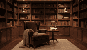
Trend 2: Grounding Browns – From Soft Mocha to Deep Coffee Bean
Soft Brown and Chocolate as the New Comfort Colors
Brown is the 2026 hero color trend, emerging as the sophisticated alternative to both gray and beige. Think soft mocha, rich chocolate, and everything in between.
Soft brown and chocolate shades add warmth and depth without feeling trendy or risky—ideal for homeowners investing in long-term renovations who want more than safe neutrals.
Consider using brown on feature walls in living rooms, cabinetry in home offices, or built-ins in family rooms to anchor the space with grounded elegance.
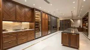
Brown pairs beautifully with brass hardware, warm oak flooring, and natural textures like linen and wool—materials commonly found in Calgary home design.
We often use deeper brown stains on wood elements to complement light neutral walls, creating timeless contrast that works with almost everything.
Where Deep Browns Work Best in Real Homes
Deep chocolate and rich brown tones create cozy, cocooning atmospheres perfect for specific applications.
Room Type | Brown Application | Pairing Suggestions |
|---|---|---|
Media walls | Deep chocolate accent wall | Light ceiling, dimmable LEDs |
Libraries | Full-room brown | Cream trim, brass fixtures |
Home bars | Mocha cabinetry | Stone counters, warm wood shelving |
Basement rec rooms | Brown feature wall | Light stretch ceiling, strategic lighting |
Room Type
Brown Application
Pairing Suggestions
Media walls
Deep chocolate accent wall
Light ceiling, dimmable LEDs
Libraries
Full-room brown
Cream trim, brass fixtures
Home bars
Mocha cabinetry
Stone counters, warm wood shelving
Basement rec rooms
Brown feature wall
Light stretch ceiling, strategic lighting
In basement rec rooms, mocha and brown tones add serious depth, especially when balanced with lighter ceilings and LED strip lighting that prevents the space from feeling dark.
Kitchen islands or lower cabinets in warm brown create visual interest while keeping upper cabinets in softer neutrals maintains balance.
Avoid using very deep brown on every wall in small, low-ceiling rooms unless paired with a light, reflective ceiling surface.
We can test sample boards under your actual lighting conditions so browns look rich rather than muddy.

Trend 3: Nature-Grounded Greens – Sage, Eucalyptus, and Earthy Dark Green
Soft Greens as Everyday Neutrals
The 2026 interior design landscape continues embracing green as a true neutral, not just an accent. Shades similar to Valspar’s Warm Eucalyptus and Benjamin Moore’s softer sage tones lead this movement.
The mood these colors create is restorative, spa-like, and connected to nature—perfect for bathrooms, bedrooms, and quiet reading corners.
Muted sage in primary suites and guest rooms pairs exceptionally well with natural linen bedding, oak furniture, and stone accents.
Sage and warm eucalyptus tones look stunning with matte or satin stretch ceilings and hidden LED perimeter lighting, creating a “floating ceiling” effect that feels both modern and serene.
Keep these greens desaturated and with warm undertones to avoid looking minty or cold in Canadian light—an interior designer familiar with local conditions can help you select the right shade.
Earthy Dark Green for Drama and Depth
Earthy dark greens offer a bold color option that still feels usable and sophisticated rather than trendy.
These deeper hues work beautifully on kitchen cabinetry, mudroom built-ins, or a single statement wall in dining rooms for a classic, tailored feel.
Dark green harmonizes with walnut wood, warm brass hardware, and stone counters—creating rich, layered palettes that feel intentional.
In basements, dark green media walls paired with acoustic panels and dimmable LEDs reduce screen glare while creating a cinema-worthy atmosphere.
Space Reno can coordinate dark green walls with acoustic stretch ceilings for combined sound control and style—especially valuable in open-plan basement layouts.
Trend 4: Touches of Jewel Tones – Teal, Plum, Burgundy, and Warm Mahogany
Teal and Smoky Jade as Accent Neutrals
Teal and smoky jade are becoming what designers call “colorful neutrals”—hues with enough depth to make a statement but enough versatility to work long-term.
Behr’s Hidden Gem exemplifies this trend: a blue-green hybrid that shifts with light, working as both a neutral and a feature color depending on application.
Use teal on bathroom vanities, tiled shower niches, or powder room walls for a luxe but not overpowering look that homeowners who love color can commit to confidently.
Teal works extremely well with glossy tiles, reflective stretch ceilings, and chrome or black fixtures for modern bathroom renovations.
In basements, teal accent walls behind a bar or game area energize the space without feeling juvenile or trendy.
Pair teal with warm woods, khaki or putty walls, and soft ivory ceilings to keep the palette grounded and sophisticated.
Plum, Burgundy, and Warm Mahogany for Moody Elegance
Deep reds and purples are having a serious moment in home design, moving from fashion runways into interiors.
Glidden’s Warm Mahogany and Graham & Brown’s Divine Damson (a deep plum with dark cherry tones) represent this trend toward moody, intimate spaces.
These hues work best in small, intimate spaces: dining rooms, home bars, powder rooms, and cozy reading corners where the enveloping feel becomes a feature.
Burgundy and plum look especially rich on paneled walls or built-in shelving, contrasted with pale ivory or cream trim for definition.
Space Reno can use these colors in bathrooms with stretch ceilings and integrated LEDs to prevent the room from feeling too dark while maintaining the dramatic mood.
If you’re nervous about full-room color drenching, use these tones in accents—one wall, cabinetry, or doors—to test your comfort level.

Trend 5: Uplifting Yellows, Ambers, and Soft Clay Tones
Buttery Yellow and Amber for Light-Filled Spaces
Yellow returns in 2026, but softer and more sophisticated than the bright yellows of decades past.
Buttery, softened yellows work beautifully in kitchens, breakfast nooks, and entries where you want spaces to feel welcoming and energized.
Amber and burnt caramel tones are trending in bathroom and tile design, adding a nostalgic, European feel that pairs with contemporary fixtures.
Pair buttery yellow walls with white or warm ivory stretch ceilings to boost natural light in east- and north-facing rooms that struggle with Alberta’s winter gray.
Amber tiles or accents in showers and backsplashes add more warmth without committing to full orange—a sophisticated approach that feels current.
These colors layer beautifully with warm mahogany, chocolate brown, and dark green for complex, layered palettes.
Soft and Deep Clay for Grounded Elegance
Clay tones—from sun-baked terracotta to muted rust to pale adobe—bring grounded, earthy elegance to 2026 interiors.
Soft clay in bedrooms and living rooms creates calm, cocooning spaces that feel protective without being dark, especially when paired with linen and woven natural textures.
Deeper clay and rust work well on accent walls or around fireplaces, balanced by lighter putty or ivory nearby.
In basements, clay tones counteract the inherent coolness of concrete and lack of natural light, making these below-grade spaces feel warm and intentional.
Choose clays with pink or brown undertones rather than orange for a more sophisticated, modern look that won’t feel dated.
These tones pair exceptionally well with cream furniture and wallpaper with subtle textural patterns.
Trend 6: Smart Use of White, Charcoal, and Khaki as Structural Colors
Updated Whites and Khakis
White isn’t disappearing in 2026—it’s evolving into softer, creamier versions that feel warmer and more livable.
Paint Color Type | Best Applications | Why It Works |
|---|---|---|
Cloud Dancer-style warm white | Ceilings, trim, built-ins | Reflects light without clinical feel |
Khaki-beige hybrids | Cabinetry, accent walls | Bridges whites and deeper hues |
Soft off-whites | Full room walls | Creates warmth in low-light spaces |
Paint Color Type
Best Applications
Why It Works
Cloud Dancer-style warm white
Ceilings, trim, built-ins
Reflects light without clinical feel
Khaki-beige hybrids
Cabinetry, accent walls
Bridges whites and deeper hues
Soft off-whites
Full room walls
Creates warmth in low-light spaces
Pantone’s Cloud Dancer represents this shift: a warm white with subtle depth rather than the icy blue-whites that dominated traditional white palettes.
Khaki and beige-khaki hybrids like Sherwin-Williams’ Universal Khaki act as bridge colors between whites and deeper shades, making color transitions feel seamless.
Use these tones on trim, doors, and built-ins to pull together mixed wood tones and colorful walls in renovations.
Warm whites for stretch ceilings reflect light beautifully without the clinical feel of pure brilliant white—especially important in spaces with LED lighting.
HGTV Home’s 2026 collection emphasizes this palette with shades like Neutral Ground and Creamy, designed to work harmoniously with other colors.
Charcoal and Iron Gray as Architectural Accents
Charcoal and deep gray now function as structural colors rather than all-over wall shades, highlighting architectural features rather than dominating spaces.
Use charcoal on interior doors, window frames, fireplace surrounds, and exterior trims to add definition and create contrast with softer wall colors.
For basements and media rooms, a mid-to-dark charcoal on the TV wall paired with acoustic panels and dimmable lighting controls glare while creating visual focus.
Charcoal elements can tie interiors to exterior upgrades for a cohesive contemporary look—especially effective when paired with modern garage renovations.
Balance charcoal with warm wood, soft neutrals, and layered textiles so spaces stay inviting rather than feeling severe or cold.
How Ceiling Colors and Stretch Ceilings Fit into 2026 Trends
Ceilings are no longer afterthoughts in 2026 interior design—they’re integral to mood, acoustics, and perceived room height. The old rule of “just paint it white” is giving way to more thoughtful approaches.
Light warm neutrals, soft stone, and Cloud Dancer-type whites work beautifully for most ceilings, reflecting light while feeling gentle rather than harsh.
In bold spaces like a plum dining room or dark green library, painting or stretching the ceiling in a slightly lighter tone of the wall color creates an enveloping, designer look that feels intentional.
Space Reno’s stretch ceilings offer eco-certified materials in matte or glossy finishes, with options for integrated LED lines, spotlights, and acoustic variants perfect for noisy basements and open-plan living areas.
Consider specific combinations: teal bathroom walls with a high-gloss white stretch ceiling that reflects light dramatically, or clay-toned basement walls with a matte ivory acoustic ceiling that absorbs sound while warming the space.

How to Test Colors in Your Home
Color only looks right when matched to lighting and materials—which is why 2026 trends emphasize the relationship between LEDs, wood grains, and stone textures rather than treating paint color in isolation.
Consider the temperature of your LED lighting when choosing colors: 2700K–3000K warm white works best with warm neutrals and browns, preventing colors from looking muddy or gray.
Test paint samples next to your actual flooring, countertops, and cabinetry rather than viewing them in isolation—colors shift dramatically depending on surrounding materials.
Space Reno’s process includes on-site consultation in Calgary homes to see how these 2026 colors behave in actual daylight and evening conditions before finalizing selections as part of broader full home renovations in Calgary.
Eco-certified stretch ceilings can enhance or soften color perception, especially in spaces with limited natural light, making them a strategic part of any color plan.
Wood tones integrate as “colors” in renovations too—white oak, walnut, and ash each bring their own undertones that interact with wall colors. Using textured finishes and richer, warmer neutrals can add more depth to interiors, enhancing visual richness and layering for a more inviting and sophisticated space.
What’s Fading Out: Colors and Finishes to Rethink for 2026
Understanding what’s cooling off helps you avoid choices that will feel dated quickly.
Colors losing momentum:
Stark bright white walls throughout entire homes
Cool icy gray in every room
Icy blue shades that feel sterile under LED light
High-contrast black-and-white schemes without warmth
What’s replacing them:
Brown, khaki, charcoal, and warm white combinations
Softer pastels and muted tones with depth
Other colors that feel personal rather than generic
Caution against committing to highly saturated, trendy colors on all cabinetry or all walls without considering resale value and long-term comfort. What feels exciting today may feel exhausting in three years.
Updating outdated elements like popcorn or asbestos-containing ceilings improves not just style but safety and light reflection throughout your space. Space Reno can help you transition from outdated palettes to these richer 2026 schemes in phases, starting with priority rooms like kitchens, basements, and bathrooms.
Planning Your 2026 Color-Forward Renovation with Space Reno
The 2026 home renovation color trends are about creating warm, layered, personal spaces—browns, greens, clays, and jewel accents balanced with thoughtful lighting and materials that work together as a cohesive sense of place. These aren’t fleeting trends; they’re grounded in a collective desire for homes that restore rather than deplete us.
Our Renovation Process
Initial vision call – Discuss your goals, style preferences, and the rooms you want to transform
In-home color and lighting consultation – See how colors behave in your actual space
Measurement and assessment – Document dimensions and existing conditions
Design proposal – Receive a complete plan with a 2026-inspired palette tailored to your home
Production – Custom stretch ceilings and materials prepared to specification
Installation – Professional installation with attention to every detail
Space Reno specializes in basement makeovers, modern bathrooms, stretch ceilings with integrated LED lighting, and acoustic comfort solutions—all areas where these 2026 color trends make the biggest impact.
If you’re in Calgary or surrounding areas, we’d love to hear about your next project and your favorite 2026 colors. Whether you’re drawn to warm eucalyptus greens, rich burgundy accents, or the timeless appeal of warm neutrals, we can show you how to adapt these trends to your actual space and lifestyle.
Ready to transform your home with colors that will still feel fresh years from now? Contact Space Reno to book a consultation and start your color-smart renovation journey. Your vision deserves a space that brings it to life.